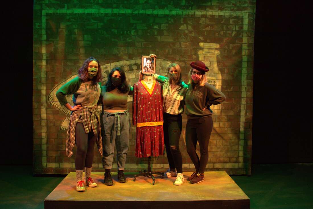
L-R: Lauren Fahrner (stage management), Hailey Panek (properties master), Angelina Adams (lighting designer), Riley Lathrom (scenic designer). Framed Photo: Robyn Gill (costume designer)
The Show's Design
|
Lighting Design (Angelina Adams)
These Shining Lives is focused on these women and their stories. Their voices should not be overshadowed by any design element. For this reason, the lighting will be kept minimalistic. The lighting is meant to lack vibrant colors and instead focus on texture to bring interest and depth. The designer imagines this show to feel as though the women and their stories are emerging from written transcripts and newspaper articles. There will only be two vibrant colors. One, the ominous green color of radium slowly encroaching into the world and growing ever so slightly through the show as echoed by the radium poisoning growing within the women's bodies. The second is a deep lavender brought out in only the final scene. This is meant to set this scene apart from the established world while hidden white Christmas lights randomly appear throughout the set; finally producing a beautiful night scene where green and lavender mix as if part of the Northern Lights and the women's stories come to an end. Scenic Design (Riley Lathrom)
In These Shining Lives we see these women being taken advantage of in the capitalistic society. My concept stems from the juxtaposition of the harsh industrial revolution of the radium dial factories, to the romanticism of their newfound economic freedom and the relationships fostered in the workplace. For my realized work I designed, rendered, and painted a backdrop from scratch that would hang behind the women. This backdrop is in the style of a "ghost-painting" which is the faded advertisement usually seen on large brick buildings left from the 1930's. This one advertising the radium products as medicinal which connects directly to the irony in the script as these women lose their lives to the harsh work environments. |
Costume Design (Robyn Gill)
In my design, I wanted to highlight each of the characters different personalities. The pink dress was made for Pearl in order to showcase her cheerful and quirky personality. Then the purple dress was made for Charlotte because she had a somber outlook, and always seems to keep the group grounded. And the deep purple conveys that state of mind well. Then the red dress was made for Frances, and the silhouette of her dress is more important than the color. The pleats on her skirt showcase how she is always trying to keep the group in line with all of the rules of the workplace and society. Compared to the other girls who all have ruffles around their skirts showing their more flexible outlook on the rules. Then Catherine was meant to be in the blue-green dress in order to foreshadow the massive effect the radium would have on her life. Properties Master (Hailey Panek)
Stage Management (Lauren Fahrner)
|
